# K-Nearest-Neighbors
```{r setup, echo=FALSE}
knitr::opts_chunk$set(fig.path="Ch10-figures/")
```
In this chapter we will explore several data visualizations of the
K-Nearest-Neighbors (KNN) classifier.
Chapter outline:
* We will start with the original static data visualization,
re-designed as two ggplots rendered by animint. There is a plot of
10-fold cross-validation error, and a plot of the predictions of the
7-Nearest-Neighbors classifier.
* We propose a re-design that allows selecting the number of neighbors
used for the model predictions.
* We propose a second re-design that allows selecting the number of
folds used to compute the cross-validation error.
## Original static figure {#static-neighbors}
We start by reproducing a static version of Figure 13.4 from
[Elements of Statistical Learning by Hastie et al](http://statweb.stanford.edu/~tibs/ElemStatLearn/). That
Figure consists of two plots:
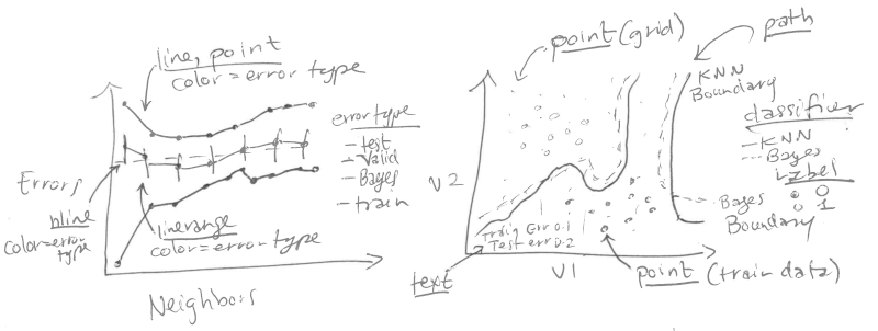
Left: mis-classification error curves, as a function of the number of
neighbors.
* `geom_line` and `geom_point` for the error curves.
* `geom_linerange` for error bars of the validation error curve.
* `geom_hline` for the Bayes error.
* x = neighbors.
* y = percent error.
* color = error type.
Right: data and decision boundaries in the two-dimensional input
feature space.
* `geom_point` for the data points.
* `geom_point` for the classification predictions on the grid in the
background.
* `geom_path` for the decision boundaries.
* `geom_text` for the train/test/Bayes error rates.
### Plot of mis-classification error curves {#static-error}
We begin by loading the data set.
```{r}
if(!requireNamespace("animint2data"))
  remotes::install_github("animint/animint2data")
data(ESL.mixture, package="animint2data")
str(ESL.mixture)
```
We will use the following components of this data set:
* `x`, the input matrix of the training data set (200 observations x 2
numeric features).
* `y`, the output vector of the training data set (200 class labels,
either 0 or 1).
* `xnew`, the grid of points in the input space where we will show the
classifier predictions (6831 grid points x 2 numeric features).
* `prob`, the true probability of class 1 at each of the grid points
(6831 numeric values between 0 and 1).
* `px1`, the grid of points for the first input feature (69 numeric
values between -2.6 and 4.2). These will be used to compute the
Bayes decision boundary using the contourLines function.
* `px2`, the grid of points for the second input feature (99 numeric
values between -2 and 2.9).
* `means`, the 20 centers of the normal distributions in the simulation
model (20 centers x 2 input features).
First, we create a test set, following the example code from
`help(ESL.mixture)`. Note that we use a `data.table` rather than a
`data.frame` to store these big data, since `data.table` is often
faster and more memory efficient for big data sets.
```{r}
library(MASS)
library(data.table)
set.seed(123)
centers <- c(
  sample(1:10, 5000, replace=TRUE),
  sample(11:20, 5000, replace=TRUE))
mix.test <- mvrnorm(10000, c(0,0), 0.2*diag(2))
test.points <- data.table(
  mix.test + ESL.mixture$means[centers,],
  label=factor(c(rep(0, 5000), rep(1, 5000))))
test.points
```
We then create a data table which includes all test points and grid
points, which we will use in the test argument to the knn function.
```{r}
pred.grid <- data.table(ESL.mixture$xnew, label=NA)
input.cols <- c("V1", "V2")
names(pred.grid)[1:2] <- input.cols
test.and.grid <- rbind(
  data.table(test.points, set="test"),
  data.table(pred.grid, set="grid"))
test.and.grid$fold <- NA
test.and.grid
```
We randomly assign each observation of the training data set to one of
ten folds.
```{r}
n.folds <- 10
set.seed(2)
mixture <- with(ESL.mixture, data.table(x, label=factor(y)))
mixture$fold <- sample(rep(1:n.folds, l=nrow(mixture)))
mixture
```
We define the following `OneFold` function, which divides the 200
observations into one train and one validation set. It then computes
the predicted probability of the K-Nearest-Neighbors classifier for
each of the data points in all sets (train, validation, test, and
grid).
```{r}
OneFold <- function(validation.fold){
  set <- ifelse(mixture$fold == validation.fold, "validation", "train")
  fold.data <- rbind(test.and.grid, data.table(mixture, set))
  fold.data$data.i <- 1:nrow(fold.data)
  only.train <- subset(fold.data, set == "train")
  data.by.neighbors <- list()
  for(neighbors in seq(1, 30, by=2)){
    if(interactive())cat(sprintf(
      "n.folds=%4d validation.fold=%d neighbors=%d\n",
      n.folds, validation.fold, neighbors))
    set.seed(1)
    pred.label <- class::knn( # random tie-breaking.
      only.train[, input.cols, with=FALSE],
      fold.data[, input.cols, with=FALSE],
      only.train$label,
      k=neighbors,
      prob=TRUE)
    prob.winning.class <- attr(pred.label, "prob")
    fold.data$probability <- ifelse(
      pred.label=="1", prob.winning.class, 1-prob.winning.class)
    fold.data[, pred.label := ifelse(0.5 < probability, "1", "0")]
    fold.data[, is.error := label != pred.label]
    fold.data[, prediction := ifelse(is.error, "error", "correct")]
    data.by.neighbors[[paste(neighbors)]] <-
      data.table(neighbors, fold.data)
  }#for(neighbors
  do.call(rbind, data.by.neighbors)
}#for(validation.fold
```
Below, we run the `OneFold` function in parallel using the
`future` package. Note that validation folds
1:10 will be used to compute the validation set error. The validation
fold 0 treats all 200 observations as a train set, and will be used
for visualizing the learned decision boundaries of the
K-Nearest-Neighbors classifier.
```{r}
future::plan("multisession")
data.all.folds.list <- future.apply::future_lapply(
  0:n.folds, function(validation.fold){
    one.fold <- OneFold(validation.fold)
    data.table(validation.fold, one.fold)
  },
  future.seed = NULL)
data.all.folds <- do.call(rbind, data.all.folds.list)
```
The data table of predictions contains almost 3 million observations!
When there are so many data, visualizing all of them at once is not
practical or informative. Instead of visualizing them all at once, we
will compute and plot summary statistics. In the code below we compute
the mean and standard error of the mis-classification error for each
model (over the 10 validation folds). This is an example of the
[summarize data table idiom](../Ch99/Ch99-appendix.html#summarize-data-table)
which is generally useful for computing summary statistics for a
single data table.
```{r}
labeled.data <- data.all.folds[!is.na(label),]
error.stats <- labeled.data[, list(
  error.prop=mean(is.error)
  ), by=.(set, validation.fold, neighbors)]
validation.error <- error.stats[set=="validation", list(
  mean=mean(error.prop),
  sd=sd(error.prop)/sqrt(.N)
  ), by=.(set, neighbors)]
validation.error
```
Below we construct data tables for the Bayes error (which we know is
0.21 for the mixture example data), and the train/test error.
```{r}
Bayes.error <- data.table(
  set="Bayes",
  validation.fold=NA,
  neighbors=NA,
  error.prop=0.21)
Bayes.error
other.error <- error.stats[validation.fold==0,]
head(other.error)
```
Below we construct a color palette from
`dput(RColorBrewer::brewer.pal(Inf, "Set1"))`, and linetype palettes.
```{r}
set.colors <- c(
  test="#377EB8", #blue
  validation="#4DAF4A",#green
  Bayes="#984EA3",#purple
  train="#FF7F00")#orange
classifier.linetypes <- c(
  Bayes="dashed",
  KNN="solid")
set.linetypes <- set.colors
set.linetypes[] <- classifier.linetypes[["KNN"]]
set.linetypes["Bayes"] <- classifier.linetypes[["Bayes"]]
cbind(set.linetypes, set.colors)
```
The code below reproduces the plot of the error curves from the
original Figure.
```{r}
library(animint2)
errorPlotStatic <- ggplot()+
  theme_bw()+
  theme_animint(width=300, rowspan=1)+
  geom_hline(aes(
    yintercept=error.prop, color=set, linetype=set),
    data=Bayes.error)+
  scale_color_manual(
    "error type", values=set.colors, breaks=names(set.colors))+
  scale_linetype_manual(
    "error type", values=set.linetypes, breaks=names(set.linetypes))+
  ylab("Misclassification Errors")+
  xlab("Number of Neighbors")+
  geom_linerange(aes(
    neighbors, ymin=mean-sd, ymax=mean+sd,
    color=set),
    data=validation.error)+
  geom_line(aes(
    neighbors, mean, linetype=set, color=set),
    data=validation.error)+
  geom_line(aes(
    neighbors, error.prop, group=set, linetype=set, color=set),
    data=other.error)+
  geom_point(aes(
    neighbors, mean, color=set),
    data=validation.error)+
  geom_point(aes(
    neighbors, error.prop, color=set),
    data=other.error)
errorPlotStatic
```
### Plot of decision boundaries in the input feature space {#static-features}
For the static data visualization of the feature space, we show only
the model with 7 neighbors.
```{r}
show.neighbors <- 7
show.data <- data.all.folds[
  validation.fold==0 & neighbors==show.neighbors]
show.points <- show.data[set=="train"]
```
Next, we compute the Train, Test, and Bayes mis-classification error
rates which we will show in the bottom left of the feature space plot.
```{r}
text.height <- 0.25
text.V1.prop <- 0
text.V2.bottom <- -2
text.V1.error <- -2.6
(error.text <- rbind(
  Bayes.error,
  other.error[neighbors==show.neighbors]
)[
, V2.top := text.V2.bottom + text.height * (1:.N)
][
, V2.bottom := V2.top - text.height
][])
```
We define the following function which we will use to compute the
decision boundaries.
```{r}
getBoundaryDT <- function(prob.vec){
  stopifnot(length(prob.vec) == 6831)
  several.paths <- with(ESL.mixture, contourLines(
    px1, px2,
    matrix(prob.vec, length(px1), length(px2)),
    levels=0.5))
  contour.list <- list()
  for(path.i in seq_along(several.paths)){
    contour.list[[path.i]] <- with(several.paths[[path.i]], data.table(
      path.i, V1=x, V2=y))
  }
  do.call(rbind, contour.list)
}
```
We use this function to compute the decision boundaries for the
learned 7-Nearest-Neighbors classifier, and for the optimal Bayes
classifier.
```{r}
boundary.grid <- show.data[set=="grid"][
, label := pred.label]
pred.boundary <- getBoundaryDT(
  boundary.grid$probability
)[
, classifier := "KNN"
][]
(Bayes.boundary <- getBoundaryDT(
  ESL.mixture$prob
)[
, classifier := "Bayes"
][])
```
Below, we consider only the grid points that do not overlap the text
labels.
```{r}
on.text <- function(V1, V2){
  V2 <= max(error.text$V2.top) & V1 <= text.V1.prop
}
show.grid <- boundary.grid[!on.text(V1, V2)]
```
The scatterplot below reproduces the 7-Nearest-Neighbors classifier of
the original Figure.
```{r}
label.colors <- c(
  "0"="#377EB8",
  "1"="#FF7F00")
scatterPlotStatic <- ggplot()+
  theme_bw()+
  theme(
    axis.text=element_blank(),
    axis.ticks=element_blank(),
    axis.title=element_blank())+
  ggtitle("7-Nearest Neighbors")+
  scale_color_manual(values=label.colors)+
  scale_linetype_manual(values=classifier.linetypes)+
  geom_point(aes(
    V1, V2, color=label),
    size=0.2,
    data=show.grid)+
  geom_path(aes(
    V1, V2, group=path.i, linetype=classifier),
    size=1,
    data=pred.boundary)+
  geom_path(aes(
    V1, V2, group=path.i, linetype=classifier),
    color=set.colors[["Bayes"]],
    size=1,
    data=Bayes.boundary)+
  geom_point(aes(
    V1, V2, color=label),
    fill=NA,
    size=3,
    shape=21,
    data=show.points)+
  geom_text(aes(
    text.V1.error, V2.bottom, label=paste(set, "Error:")),
    data=error.text,
    hjust=0)+
  geom_text(aes(
    text.V1.prop, V2.bottom, label=sprintf("%.3f", error.prop)),
    data=error.text,
    hjust=1)
scatterPlotStatic
```
### Combined plots {#static-combined}
Finally, we combine the two ggplots and render them as an animint.
```{r Ch10-viz-static}
animint(errorPlotStatic, scatterPlotStatic)
```
This data viz does have three interactive legends, but it is static in
the sense that it displays only the model predictions for 7-Nearest
Neighbors.
## Select the number of neighbors using interactivity {#neighbors}
In this section we propose an interactive re-design which allows the
user to select K, the number of neighbors in the K-Nearest-Neighbors
classifier.
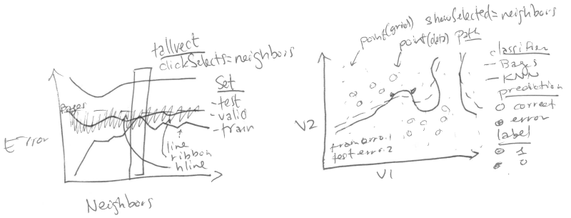
### Clickable error curves plot {#neighbors-error}
We begin with a re-design of the error curves plot.
Note the following changes:
* add a selector for the number of neighbors (`geom_tallrect`).
* change the Bayes decision boundary from `geom_hline` with a legend
entry, to a `geom_segment` with a text label.
* add a linetype legend to distinguish error rates from the Bayes and
KNN models.
* change the error bars (`geom_linerange`) to error bands (`geom_ribbon`).
The only new data that we need to define are the endpoints of the
segment that we will use to plot the Bayes decision boundary. Note
that we also re-define the set "test" to emphasize the fact that the
Bayes error is the best achievable error rate for test data.
```{r}
Bayes.segment <- data.table(
  Bayes.error,
  classifier="Bayes",
  min.neighbors=1,
  max.neighbors=29
)[, set := "test"]
```
We also add an error variable to the data tables that contain the
prediction error of the K-Nearest-Neighbors models. This error
variable will be used for the linetype legend.
```{r}
validation.error$classifier <- "KNN"
other.error$classifier <- "KNN"
```
We re-define the plot of the error curves below. Note that
* We use showSelected in `geom_text` and `geom_ribbon`, so that they will
be hidden when the interactive legends are clicked.
* We use clickSelects in `geom_tallrect`, to select the number of
neighbors. Clickable geoms should be last (top layer) so that they
are not obscured by non-clickable geoms (bottom layers).
```{r}
set.colors <- c(
  test="#984EA3",#purple
  validation="#4DAF4A",#green
  Bayes="#984EA3",#purple
  train="black")
errorPlot <- ggplot()+
  ggtitle("Select number of neighbors")+
  theme_bw()+
  theme_animint(width=300)+
  geom_text(aes(
    min.neighbors, error.prop,
    color=set, label="Bayes"),
    showSelected="classifier",
    hjust=1,
    data=Bayes.segment)+
  geom_segment(aes(
    min.neighbors, error.prop,
    xend=max.neighbors, yend=error.prop,
    color=set,
    linetype=classifier),
    showSelected="classifier",
    data=Bayes.segment)+
  scale_color_manual(values=set.colors, breaks=names(set.colors))+
  scale_fill_manual(values=set.colors)+
  guides(fill="none", linetype="none")+
  scale_linetype_manual(values=classifier.linetypes)+
  ylab("Misclassification Errors")+
  scale_x_continuous(
    "Number of Neighbors",
    limits=c(-3, 30),
    breaks=c(1, 10, 20, 29))+
  geom_ribbon(aes(
    neighbors, ymin=mean-sd, ymax=mean+sd,
    fill=set),
    showSelected=c("classifier", "set"),
    alpha=0.5,
    color="transparent",
    data=validation.error)+
  geom_line(aes(
    neighbors, mean, color=set,
    linetype=classifier),
    showSelected="classifier",
    data=validation.error)+
  geom_line(aes(
    neighbors, error.prop, group=set, color=set,
    linetype=classifier),
    showSelected="classifier",
    data=other.error)+
  geom_tallrect(aes(
    xmin=neighbors-1, xmax=neighbors+1),
    clickSelects="neighbors",
    alpha=0.5,
    data=validation.error)
errorPlot
```
### Feature space plot that shows the selected number of neighbors {#neighbors-features}
Next, we focus on a re-design of the feature space plot. In the
previous section we considered only the subset of data from the model
with 7 neighbors. Our re-design includes the following changes:
* We use neighbors as a showSelected variable.
* We add a legend to show which training data points are
mis-classified.
* We use equal spaced coordinates so that visual distance (pixels) is
the same as the Euclidean distance in the feature space.
```{r}
show.data <- data.all.folds[validation.fold==0]
show.points <- show.data[set=="train"]
```
Below, we compute the predicted decision boundaries separately for
each K-Nearest-Neighbors model.
```{r}
boundary.grid <- show.data[set=="grid"][
, label := pred.label]
show.grid <- boundary.grid[!on.text(V1, V2)]
(pred.boundary <- boundary.grid[
, getBoundaryDT(probability), by=neighbors
][, classifier := "KNN"][])
```
Instead of showing the number of neighbors in the plot title, below we
create a `geom_text` element that will be updated based on the number of
selected neighbors.
```{r}
show.text <- show.grid[, .(
  V1=mean(range(V1)),
  V2=3.05
), by=neighbors]
```
Below we compute the position of the text in the bottom left, which we
will use to display the error rate of the selected model.
```{r}
other.error[, V2.bottom := rep(
  text.V2.bottom + text.height * 1:2, l=.N)]
```
Below we re-define the Bayes error data without a neighbors column, so
that it appears in each showSelected subset.
```{r}
Bayes.error <- data.table(
  set="Bayes",
  error.prop=0.21)
```
Finally, we re-define the ggplot, using neighbors as a showSelected
variable in the point, path, and text geoms.
```{r}
scatterPlot <- ggplot()+
  ggtitle("Mis-classification errors in train set")+
  theme_bw()+
  theme_animint(width=450, colspan=1)+
  scale_x_continuous(
    "Input feature 1",
    breaks=seq(-2, 4))+
  ylab("Input feature 2")+
  scale_color_manual(values=label.colors)+
  scale_linetype_manual(values=classifier.linetypes)+
  geom_point(aes(
    V1, V2, color=label),
    showSelected="neighbors",
    size=0.2,
    data=show.grid)+
  geom_path(aes(
    V1, V2, group=path.i, linetype=classifier),
    showSelected="neighbors",
    size=1,
    data=pred.boundary)+
  geom_path(aes(
    V1, V2, group=path.i, linetype=classifier),
    color=set.colors[["test"]],
    size=1,
    data=Bayes.boundary)+
  geom_point(aes(
    V1, V2, color=label,
    fill=prediction),
    showSelected="neighbors",
    size=3,
    shape=21,
    data=show.points)+
  scale_fill_manual(values=c(error="black", correct="transparent"))+
  geom_text(aes(
    text.V1.error, text.V2.bottom, label=paste(set, "Error:")),
    data=Bayes.error,
    hjust=0)+
  geom_text(aes(
    text.V1.prop, text.V2.bottom, label=sprintf("%.3f", error.prop)),
    data=Bayes.error,
    hjust=1)+
  geom_text(aes(
    text.V1.error, V2.bottom, label=paste(set, "Error:")),
    showSelected="neighbors",
    data=other.error,
    hjust=0)+
  geom_text(aes(
    text.V1.prop, V2.bottom, label=sprintf("%.3f", error.prop)),
    showSelected="neighbors",
    data=other.error,
    hjust=1)+
  geom_text(aes(
    V1, V2,
    label=paste0(
      neighbors,
      " nearest neighbor",
      ifelse(neighbors==1, "", "s"),
      " classifier")),
    showSelected="neighbors",
    data=show.text)
```
Before compiling the interactive data viz, we print a static ggplot
with a facet for each value of neighbors.
```{r}
scatterPlot+
  facet_wrap("neighbors")+
  theme(panel.margin=grid::unit(0, "lines"))
```
### Combined interactive data viz {#neighbors-combined}
Finally, we combine the two plots in a single data viz with neighbors
as a selector variable.
```{r Ch10-viz-neighbors}
animint(
  errorPlot,
  scatterPlot,
  first=list(neighbors=7),
  time=list(variable="neighbors", ms=3000))
```
Note that neighbors is used as a time variable, so animation shows the
predictions of the different models.
## Select the number of cross-validation folds using interactivity {#folds}
In this section we discuss a second re-design which allows the user to
select the number of folds used to compute the validation error curve.
The for loop below computes the validation error curve for several
different values of `n.folds`.
```{r}
error.by.folds <- list()
error.by.folds[["10"]] <- data.table(n.folds=10, validation.error)
for(n.folds in c(3, 5, 15)){
  set.seed(2)
  mixture <- with(ESL.mixture, data.table(x, label=factor(y)))
  mixture$fold <- sample(rep(1:n.folds, l=nrow(mixture)))
  only.validation.list <- future.apply::future_lapply(
    1:n.folds, function(validation.fold){
      one.fold <- OneFold(validation.fold)
      data.table(validation.fold, one.fold[set=="validation"])
    }, future.seed=NULL)
  only.validation <- do.call(rbind, only.validation.list)
  only.validation.error <- only.validation[, list(
    error.prop=mean(is.error)
  ), by=.(set, validation.fold, neighbors)]
  only.validation.stats <- only.validation.error[, list(
    mean=mean(error.prop),
    sd=sd(error.prop)/sqrt(.N)
  ), by=.(set, neighbors)]
  error.by.folds[[paste(n.folds)]] <-
    data.table(n.folds, only.validation.stats, classifier="KNN")
}
validation.error.several <- do.call(rbind, error.by.folds)
```
The code below computes the minimum of the error curve for each value
of `n.folds`.
```{r}
min.validation <- validation.error.several[
, .SD[which.min(mean)]
, by=n.folds]
```
The code below creates a new error curve plot with two facets.
```{r}
facets <- function(df, facet)data.frame(df, facet=factor(
  facet, c("n.folds", "Misclassification Errors")))
errorPlotNew <- ggplot()+
  ggtitle("Select # of folds and neighbors")+
  theme_bw()+
  theme_animint(width=325)+
  theme(panel.margin=grid::unit(0, "cm"))+
  facet_grid(facet ~ ., scales="free")+
  geom_text(aes(
    min.neighbors, error.prop,
    color=set, label="Bayes"),
    showSelected="classifier",
    hjust=1,
    data=facets(Bayes.segment, "Misclassification Errors"))+
  geom_segment(aes(
    min.neighbors, error.prop,
    xend=max.neighbors, yend=error.prop,
    color=set,
    linetype=classifier),
    showSelected="classifier",
    data=facets(Bayes.segment, "Misclassification Errors"))+
  scale_color_manual(values=set.colors, breaks=names(set.colors))+
  scale_fill_manual(values=set.colors, breaks=names(set.colors))+
  guides(fill="none", linetype="none")+
  scale_linetype_manual(values=classifier.linetypes)+
  ylab("")+
  scale_x_continuous(
    "Number of Neighbors",
    limits=c(-3, 30),
    breaks=c(1, 10, 20, 29))+
  geom_ribbon(aes(
    neighbors, ymin=mean-sd, ymax=mean+sd,
    fill=set),
    showSelected=c("classifier", "set", "n.folds"),
    alpha=0.5,
    color="transparent",
    data=facets(validation.error.several, "Misclassification Errors"))+
  geom_line(aes(
    neighbors, mean, color=set,
    linetype=classifier),
    showSelected=c("classifier", "n.folds"),
    data=facets(validation.error.several, "Misclassification Errors"))+
  geom_line(aes(
    neighbors, error.prop, group=set, color=set,
    linetype=classifier),
    showSelected="classifier",
    data=facets(other.error, "Misclassification Errors"))+
  geom_tallrect(aes(
    xmin=neighbors-1, xmax=neighbors+1),
    clickSelects="neighbors",
    alpha=0.5,
    data=validation.error)+
  geom_point(aes(
    neighbors, n.folds, color=set),
    clickSelects="n.folds",
    size=9,
    data=facets(min.validation, "n.folds"))
```
The code below previews the new error curve plot, adding an additional
facet for the showSelected variable.
```{r}
errorPlotNew+facet_grid(facet ~ n.folds, scales="free")
```
The code below creates an interactive data viz using the new error
curve plot.
```{r Ch10-viz-folds}
animint(
  errorPlotNew,
  scatterPlot,
  first=list(neighbors=7, n.folds=10))
```
## Chapter summary and exercises {#Ch10-exercises}
We showed how to add two interactive features to a data visualization
of predictions of the K-Nearest-Neighbors model. We started with a
static data visualization which only showed predictions of the
7-Nearest-Neighbors model. Then, we created an interactive re-design
which allowed selecting K, the number of neighbors. We did another
re-design which added a facet for selecting the number of
cross-validation folds.
Exercises:
* Make it so that text error rates in the bottom left of the second
plot are hidden after clicking the legend entries for Bayes, train,
test. Hint: you can either use one `geom_text` with
`showSelected=c(selectorNameColumn="selectorValueColumn")` (as
explained in [Chapter 14](../Ch14/Ch14-PeakSegJoint.html)) or two
`geom_text`, each with a different showSelected parameter.
* The probability column of the show.grid data table is the predicted
probability of class 1. How would you re-design the visualization to
show the predicted probability rather than the predicted class at
each grid point? The main challenge is that probability is a numeric
variable, but ggplot scales must be either
continuous or discrete (not both). You could use a continuous fill
scale, but then you would have to use a different scale to show the
prediction variable.
* Add a new plot that shows the relative sizes of the train,
validation, and test sets. Make sure that the plotted size of the
validation and train sets change based on the selected value of
`n.folds`.
* So far, the feature space plots only showed model predictions and
errors for the entire train data set (validation.fold==0). Create a
re-design which includes a new plot or facet for selecting
validation.fold, and a facetted feature space plot (one facet for
train set, one facet for validation set).
Next, [Chapter 11](../Ch11/Ch11-lasso.html) explains how to visualize the
Lasso, a machine learning model.


