library(animint2)
data(WorldBank)
WorldBank$Region <- sub(
  " (all income levels)", "", WorldBank$region, fixed=TRUE)
library(data.table)
not.na <- data.table(WorldBank)[
  !(is.na(life.expectancy) | is.na(fertility.rate))
]8 World Bank
In this chapter we will explore several data visualizations of the World Bank data set.
Chapter outline:
- We begin by loading the World Bank data set and defining some helper functions for creating a multi-panel ggplot with several geoms.
- We then create a time series plot for life expectancy.
- We then add a scatterplot of life expectancy versus fertility rate as a second panel.
- We then add a third panel with a time series for fertility rate.
8.1 Load data and define helper functions
First we load the WorldBank data set, and consider only the subset which has both non-missing values for both life.expectancy and fertility.rate.
We will also be plotting the population variable using a size legend. Before plotting, we will make sure that none of the values are missing.
not.na[is.na(not.na$population)] iso2c country year fertility.rate life.expectancy population
1: KW Kuwait 1992 2.338 72.95266 NA
2: KW Kuwait 1993 2.341 73.07373 NA
3: KW Kuwait 1994 2.413 73.18724 NA
GDP.per.capita.Current.USD 15.to.25.yr.female.literacy iso3c
1: NA NA KWT
2: NA NA KWT
3: NA NA KWT
region capital longitude
1: Middle East & North Africa (all income levels) Kuwait City 47.9824
2: Middle East & North Africa (all income levels) Kuwait City 47.9824
3: Middle East & North Africa (all income levels) Kuwait City 47.9824
latitude income lending Region
1: 29.3721 High income: nonOECD Not classified Middle East & North Africa
2: 29.3721 High income: nonOECD Not classified Middle East & North Africa
3: 29.3721 High income: nonOECD Not classified Middle East & North AfricaThe table above shows that there are three rows with missing values for the population variable. They are for the country Kuwait during 1992-1994. The table below shows the data from the neighboring years, 1991-1995.
not.na[
  country == "Kuwait" & 1991 <= year & year <= 1995,
  .(country, year, population)]
country year population
1: Kuwait 1991 1999651
2: Kuwait 1992 NA
3: Kuwait 1993 NA
4: Kuwait 1994 NA
5: Kuwait 1995 1586123The table above shows that the population of Kuwait decreased over the period 1991-1995, consistent with the Gulf War of that time period. We fill in those missing values below.
not.na[is.na(population), population := 1700000]
not.na[
  country == "Kuwait" & 1991 <= year & year <= 1995,
  .(country, year, population)]
country year population
1: Kuwait 1991 1999651
2: Kuwait 1992 1700000
3: Kuwait 1993 1700000
4: Kuwait 1994 1700000
5: Kuwait 1995 1586123Next, we define the following helper function, which will be used to add columns to data sets in order to assign geoms to facets.
FACETS <- function(df, top, side)data.frame(
  df,
  top=factor(top, c("Fertility rate", "Years")),
  side=factor(side, c("Years", "Life expectancy")))
Note that the factor levels will specify the order of the facets in the ggplot. This is an example of the addColumn then facet idiom. Below, we define three more helper functions, one for each facet.
TS.LIFE <- function(df)FACETS(df, "Years", "Life expectancy")
SCATTER <- function(df)FACETS(df, "Fertility rate", "Life expectancy")
TS.FERT <- function(df)FACETS(df, "Fertility rate", "Years")
8.2 First time series plot
First we define a data set with one row for each year, which we will use for selecting years using a geom_tallrect in the background.
years <- unique(not.na[, .(year)])We define the ggplot with a geom_tallrect in the background, and a geom_line for the time series.
line_alpha <- 3/5
line_size <- 4
ts.right <- ggplot()+
  geom_tallrect(aes(
    xmin=year-1/2, xmax=year+1/2),
    clickSelects="year",
    data=TS.LIFE(years), alpha=1/2)+
  geom_line(aes(
    year, life.expectancy, group=country, color=Region),
    clickSelects="country",
    data=TS.LIFE(not.na), size=line_size, alpha=line_alpha)
ts.right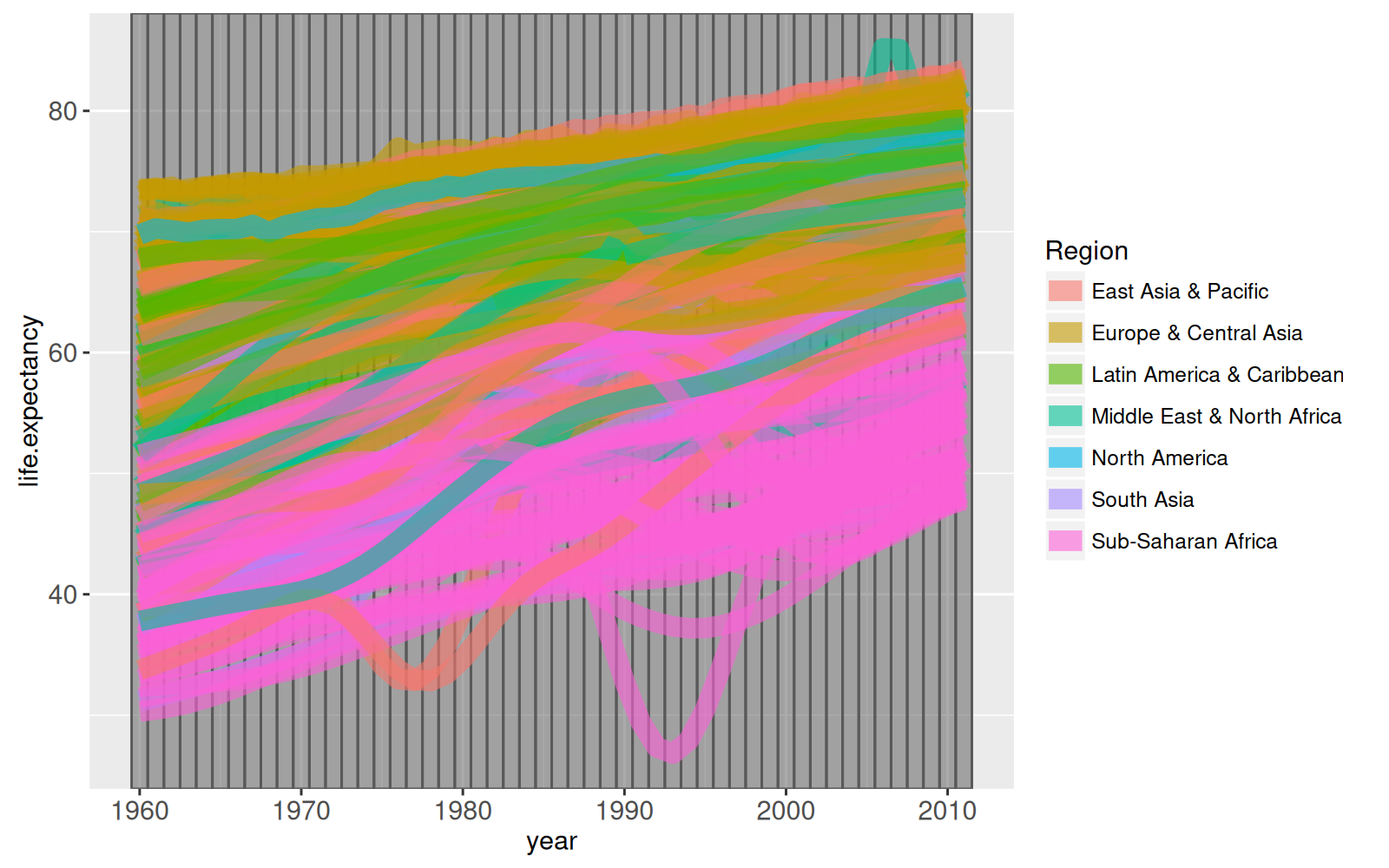
Note that we specified clickSelects=year so that clicking a tallrect will change the selected year, and clickSelects=country so that clicking a line will select or de-select a country. Also note that we used TS.LIFE to specify columns that we will use in the facet specification (next section).
8.3 Add a scatterplot facet
We begin by simply adding facets to the previous time series plot.
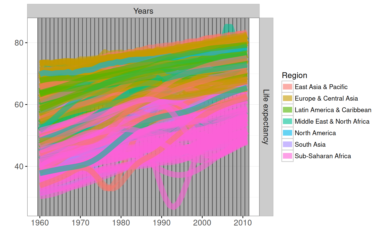
We set the panel.margin to 0, which is often a good idea to save space in a ggplot with facets. We use scales="free" and hide the axis labels, in an example of the addColumn then facet idiom. Instead, we use the facet label to show the variable encoded on each axis. Below, we add a scatterplot facet with a point for each year and country.
ts.scatter <- ts.facet+
  theme_animint(width=600)+
  geom_point(aes(
    fertility.rate, life.expectancy,
    color=Region, size=population,
    key=country), # key aesthetic for animated transitions!
    clickSelects="country",
    showSelected="year",
    data=SCATTER(not.na))+
  scale_size_animint(pixel.range=c(2, 20), breaks=10^(9:5))
ts.scatter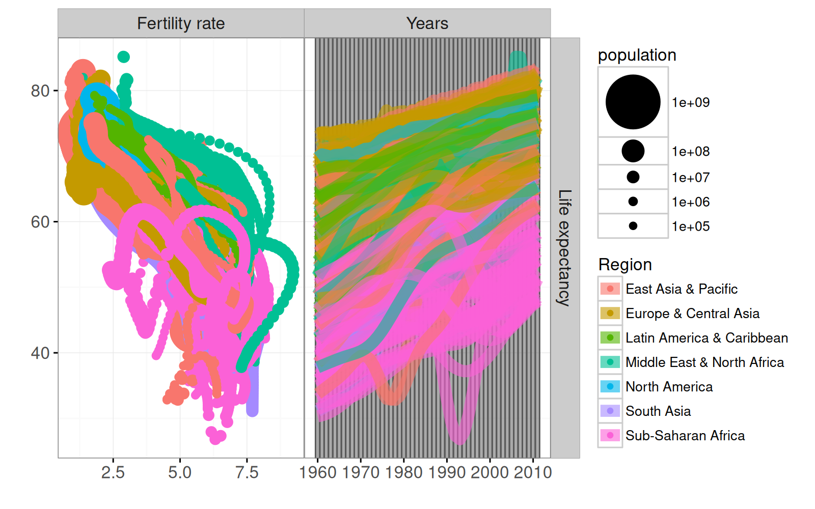
Note how we use scale_size_animint to specify the range of sizes in pixels, and the breaks in the legend. Also note that we use SCATTER to specify top and side columns which are used in the facet specification. We also render this ggplot interactively below.
animint(ts.scatter)Note that single selection is used by default for both year and country.
- The selected year is shown as a grey rectangle on the right.
- The selected country is shown with more opacity in the
geom_pointon the left, and in thegeom_lineon the right.
Exercise: how would you further emphasize the selected year and country? Hint: you can modify the alpha_off parameter from the default of 0.5 to a smaller value, like 0.2. Try using color_off, which can not be used in combination with aes(color), so try using aes(fill) instead in the geom_point.
8.4 Adding another time series facet
Below we add widerects for selecting years, and paths for showing fertility rate.
scatter.both <- ts.scatter+
  geom_widerect(aes(
    ymin=year-1/2, ymax=year+1/2),
    clickSelects="year",
    data=TS.FERT(years), alpha=1/2)+
  geom_path(aes(
    fertility.rate, year, group=country, color=Region),
    clickSelects="country",
    data=TS.FERT(not.na), size=line_size, alpha=line_alpha)
scatter.both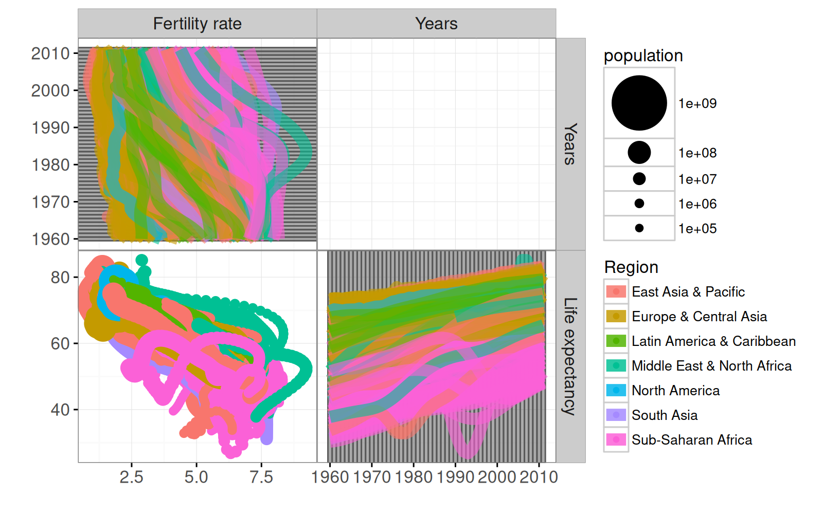
Note in the code above that TS.FERT was used to specify facet columns top and side. A final touch is to add text labels to the time series, using geom_label_aligned, which is new in animint2 (it is not in ggplot2). It is a text label that adjusts its position to avoid overlaps with other labels with the same y value (in horizontal alignment). The code below first creates a data set with the extreme values of year, and then uses that with alignment="horizontal".
Note in the code above that we set vjust
- to 1 so that the top of the label is aligned with the min year at the bottom of the panel.
- to 0 so that the bottom of the label is aligned with the max year at the top of the panel.
We render an interactive version below.
The visualization above has three facets: two time series, and one scatter plot. The fertility rate time series shows two labels for each selected country, with a few special features:
- If the values of fertility rate for selected countries are too close, then the label positions are adjusted to avoid overlapping text.
- If there are selected countries near the left/right plot boundaries, then the labels are adjusted to avoid going outside of these boundaries.
- If there are too many countries selected to display all text labels in the available space (between left and right boundaries), then the text size is reduced until the text labels fit.
- These features are used in each group of labels with the same Y value, because
alignment="horizontal"was specified.
Try selecting a few more neighboring countries to see how this works.
8.5 Chapter summary and exercises
We showed how to create a multi-layer, multi-panel (but single-plot) visualization of the World Bank data.
Exercises:
- Simplify the code by using
make_*()instead ofgeom_*()fortallrectandwiderect. - The X axis for fertility rate shows default breaks 2.5, 5.0, 7.5. Change these to 2, 4, 6, 8. Hint: use
breaksargument ofscale_x_continuous. - Since no smooth transition has been specified for
country, the text labels appear and disappear instantaneously when the set of selected countries is modified. Try adding a smooth transition, by adding the globaldurationoption, and by addingaes(key)to thegeom_label_aligned. Hint: since there are two labels for each country, the key should depend on bothyearandcountry. - Make it so that clicking a country label de-selects the corresponding country.
- Add text labels to the time series plot on the right, with names for each country, using
geom_label_aligned(alignment="vertical"). Each label should appear only when the country is selected, and should disappear after clicking on the label. - Add a text label to the scatterplot to indicate the selected year.
- Add text labels to the scatterplot, with names for each country. Each label should appear only when the country is selected, and should disappear after clicking on the label.
- Add points on each time series plot, with size proportional to population, as in the scatterplot. The points should appear only when the country is selected, and clicking the points should de-select that country.
- As in this gallery example, add world map in the Year/Year facet which is currently empty.
Next, Chapter 9 explains how to visualize the Montreal bike data set.