if(!requireNamespace("animint2"))install.packages("animint2")Loading required namespace: animint2This chapter explains the grammar of graphics, which is a powerful model for describing a large class of data visualizations. After reading this chapter, you will be able to
animint2 R packageanimint2
Most computer systems for data analysis provide functions for creating plots to visualize patterns in data. The oldest systems provide very general functions for drawing basic plot components such as lines and points (e.g. the graphics and grid packages in R). If you use one of these general systems, then it is your job to put the components together to form a meaningful, interpretable plot. The advantage of general systems is that they impose few limitations on what kinds of plots can be created. The disadvantage is that general systems typically do not provide functions for automating common plotting tasks (axes, panels, legends).
To overcome the disadvantages of these general plotting systems, charting packages such as lattice were developed (Sarkar, 2008). Such packages have several pre-defined chart types, and provide a dedicated function for creating each chart type. For example, lattice provides the bwplot function for making box and whisker plots. The advantage of such systems is that they provide a column name specification interface that simplifies creation of entire plots, including legends and panels. Crucially, this column name specification interface allows for rapid experimentation with different plot designs (for example, exchanging the variables used for legends and panels). The disadvantage is the set of pre-defined chart types, which means that it is not easy to create more complex graphics (with several layers of geoms super-imposed on top of each other, each with its own data).
Newer plotting systems based on the grammar of graphics are situated between these two extremes. Wilkinson proposed the grammar of graphics in order to describe and create a large class of plots (Wilkinson, 2005). Wickham later implemented several ideas from the grammar of graphics in the ggplot2 R package (Wickham, 2009). The ggplot2 package has several advantages with respect to previous plotting systems.
lattice, ggplot2 imposes few limitations on the types of plots that can be created (there are no pre-defined chart types). So it is possible to create complex graphics, with different layers plotted on top of each other, each with its own data.lattice, ggplot2 simplifies creation of legends and panels via a column name specification interface (and so makes it easy to rapidly experiment with using different variables in different plot designs).ggplot2 is based on the grammar of graphics, an explicit mapping of data variables to visual properties is required. Later in this chapter, we will explain how this mapping allows sketches of plot ideas to be directly translated into R code.Finally, all of the previously discussed plotting systems are intended for creating static graphics, which can be viewed equally well on a computer screen or on paper. However, the main topic of this manual is animint2, an R package for interactive graphics. In contrast to static graphics, interactive graphics are best viewed on a computer with a mouse and keyboard that can be used to interact with the plot.
Since many concepts from static graphics are also useful in interactive graphics, the animint2 package is implemented as an extension/fork of ggplot2. In this chapter we will introduce the main features of ggplot2 which will also be useful for interactive plot design in later chapters.
In 2013, we created the animint package, which depends on the ggplot2 package. However during 2014-2017, the ggplot2 package introduced many changes that were incompatible with the interactive grammar of animint. Therefore in 2018 we created the animint2 package which copies/forks the relevant parts of the ggplot2 package. Now animint2 can be used without having ggplot2 installed. In fact, it is recommended to use library(animint2) without attaching ggplot2. However it is fine to use animint2 along with packages that import/load ggplot2. For an example, see Chapter 16, which uses the penaltyLearning package (which imports ggplot2).
animint2
To install the most recent release of animint2 from CRAN,
if(!requireNamespace("animint2"))install.packages("animint2")Loading required namespace: animint2To install an even more recent development version of animint2 from GitHub,
if(!requireNamespace("animint2")){
  if(!requireNamespace("remotes"))install.packages("remotes")
  remotes::install_github("tdhock/animint2")
}
Once you have installed animint2, you can load and attach all of its exported functions via:
This section explains how to translate a plot sketch into R code. We use a data set from the World Bank as an example. We begin by loading it and examining its column names.
 [1] "iso2c"                       "country"
 [3] "year"                        "fertility.rate"
 [5] "life.expectancy"             "population"
 [7] "GDP.per.capita.Current.USD"  "15.to.25.yr.female.literacy"
 [9] "iso3c"                       "region"
[11] "capital"                     "longitude"
[13] "latitude"                    "income"
[15] "lending"
We see 15 column names above. The WorldBank data set consist of measures such as fertility rate and life expectancy for each country over the period 1960-2010. To simplify the output below, we compute an abbreviated Region column, and consider only the subset of data which are relevant for the data visualizations below.
                  Region  country year fertility.rate life.expectancy
13032 Sub-Saharan Africa Zimbabwe 2006          3.551        44.70178
13033 Sub-Saharan Africa Zimbabwe 2007          3.491        45.79707
13034 Sub-Saharan Africa Zimbabwe 2008          3.428        47.07061
13035 Sub-Saharan Africa Zimbabwe 2009          3.360        48.45049
13036 Sub-Saharan Africa Zimbabwe 2010          3.290        49.86088
13037 Sub-Saharan Africa Zimbabwe 2011 3.219 51.23644dim(world_bank)[1] 9852 5The code above prints the last few rows, and the dimension of the data table (9852 rows and 5 columns).
Suppose that we are interested to see if there is any relationship between life expectancy and fertility rate. We could fix one year, then use those two data variables in a scatterplot. Consider the figure below which sketches the main components of that data visualization.
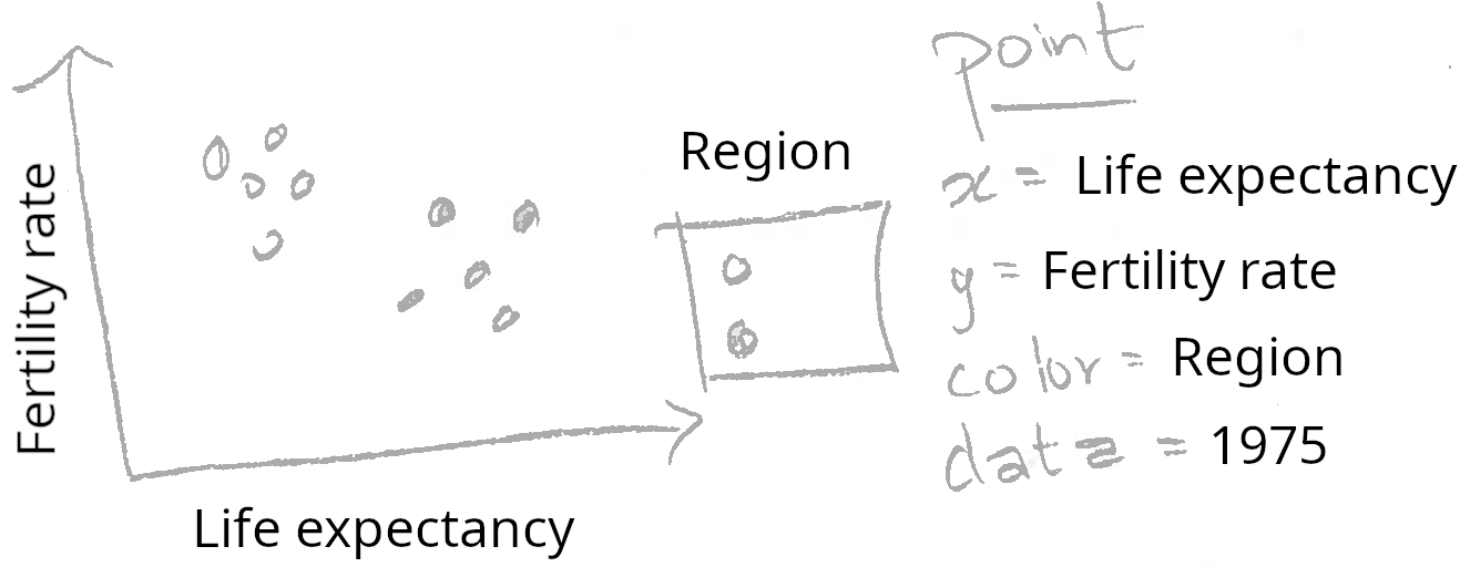
The sketch above shows life expectancy on the horizontal (x) axis, fertility rate on the vertical (y) axis, and a legend for the region. These elements of the sketch can be directly translated into R code using the following method. First, we need to construct a data table that has one row for every country in 1975, and columns named life.expectancy, fertility.rate, and region. The world_bank data already has these columns, so all we need to do is consider the subset for the year 1975:
                          Region      country year fertility.rate
11623        East Asia & Pacific      Vanuatu 1975          5.929
11676        East Asia & Pacific        Samoa 1975          5.237
12524 Middle East & North Africa  Yemen, Rep. 1975          8.089
12683         Sub-Saharan Africa South Africa 1975          5.251
12895         Sub-Saharan Africa       Zambia 1975          7.435
13001         Sub-Saharan Africa     Zimbabwe 1975          7.395
      life.expectancy
11623        55.47998
11676        57.46951
12524        43.40459
12683        54.57920
12895        51.04137
13001        56.71702
The code above prints the data for 1975, which clearly has the appropriate columns, and one row for each country. The next step is to use the notes in the sketch to code a ggplot with a corresponding aes or aesthetic mapping of data variables to visual properties:
scatter <- ggplot()+
  geom_point(
    mapping=aes(x=life.expectancy, y=fertility.rate, color=Region),
    data=world_bank_1975)
scatter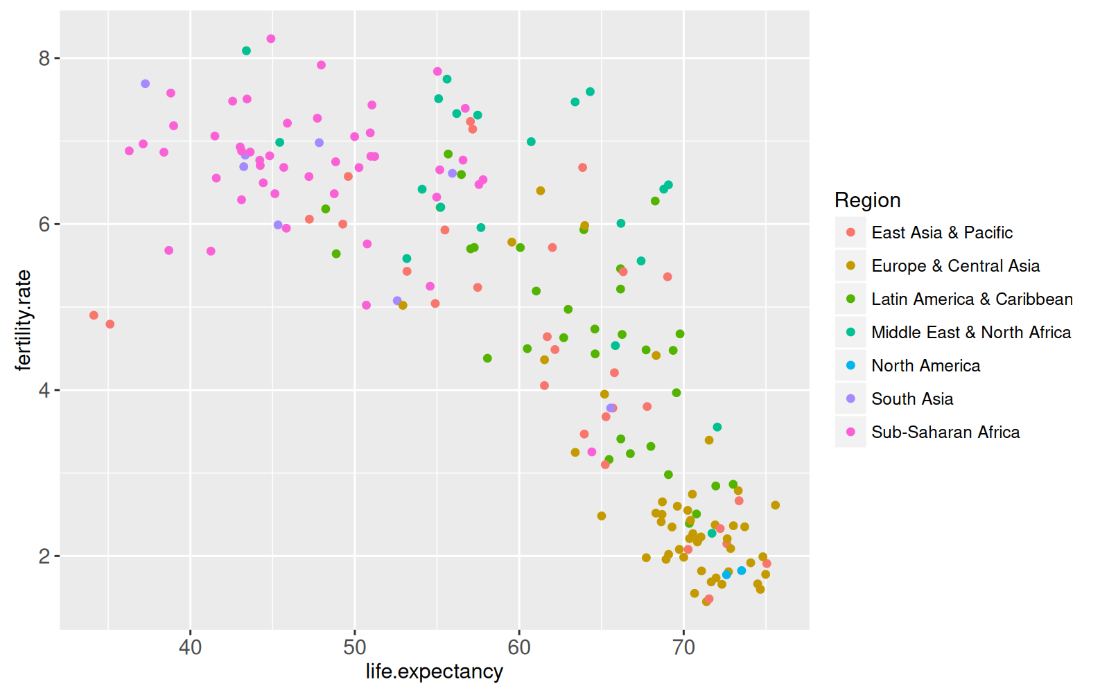
The aes function is called with names for visual properties (x, y, color) and values for the corresponding data variables (life.expectancy, fertility.rate, region). This mapping is applied to the variables in the world_bank_1975 data table, in order to create the visual properties of the geom_point. The ggplot was saved as the scatter object, which when printed on the R command line shows the plot on a graphics device. Note that we automatically have a region color legend.
This section explains how the animint2 package can be used to render ggplots on web pages. The ggplot from the previous section can be rendered with animint2, by using the animint function.
animint(scatter)If, when you run the code above, the animint does not render in your web browser for some reason (for example if you see a blank web page), then please consult our wiki FAQ which will help you find a solution. Internally, the animint function creates a list of class animint, and then R runs the print.animint function via the S3 object system. The animint2 package implements a compiler that takes the list as input, and outputs a web page with a data visualization. The compiler is the animint2dir function, which compiles the animint scatter.viz list to a directory of data and code files that can be rendered in a web browser. It is activated automatically by the print.animint function.
When viewed in a web browser, the animint plot should look mostly the same as static versions produced by standard R graphics devices. One difference is that the region legend is interactive: clicking a legend entry will hide or show the points of that color.
Exercise: try changing the aes mapping of the ggplot, and then making a new animint. Quantitative variables like population are best shown using the x/y axes or point size. Qualitative variables like lending are best shown using point color or fill.
Multi-layer data visualization is useful when you want to display several different geoms or data sets in the same plot. For example, consider the following sketch which adds a geom_path to the previous data visualization.
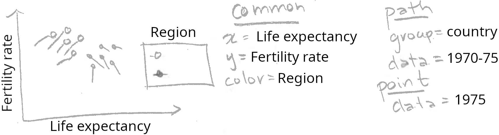
Note how the sketch above includes two different geoms (point and path). The two geoms share a common definition of the x, y, and color aesthetics, but have different data sets. Below we translate this sketch into R code.
Note that we save the return value of the animint function to the viz.two.layers object (which is also printed due to the parentheses). In this manual we will often use variable names that start with viz to denote animint data visualization objects, which are in fact lists of ggplots and options.
The plot above shows a data visualization with 2 geoms/layers:
geom_point shows the life expectancy, fertility rate, and region of all countries in 1975.geom_path shows the same variables for the previous 5 years.The addition of the geom_path shows how the countries changed over time. In particular, it shows that most countries moved to the right and down, meaning higher life expectancy and lower fertility rate. However, there are some exceptions. For example, the two East Asian countries in the bottom left suffered a decrease in life expectancy over this period. And there are some countries which showed an increased fertility rate.
Exercise: try changing the region legend to an income legend. Hint: you need to use the same aes(color=income) specification for all geoms, and you will need to use the original WorldBank data with all columns (not world_bank which has a limited number of columns). You may want to use scale_color_manual with a sequential color palette, see RColorBrewer::display.brewer.all(type="seq") and read the appendix for more details.
Can we add the names of the countries to the data viz? Below, we add another layer with a text label for each country’s name.
This data viz is not so easy to read, since there are so many overlapping text labels. The interactive region legend helps a little, by allowing the user to hide data from selected regions. However, it would be even better if the user could show and hide the text for individual countries. That type of interaction can be achieved using the showSelected and clickSelects parameters, which we explain in Chapters 3-4.
Exercise: Re-make this data visualization using aes(tooltip), which is a new feature in animint2 (not present in ggplot2), and is discussed in Chapter 5. Set aes(tooltip=country) so that the country name will be visible when you hover the cursor over the corresponding geom.
Next, we move on to discuss a major strength of animint: data visualization with multiple linked plots.
Multi-plot data visualization is useful when you want to show some related data sets using more than one aesthetic mapping. In interactive data visualization, one plot is often used to display a summary, and another plot is used to display details. For example, consider a data visualization with two plots: a time series with World Bank data from 1960-2010 (summary), and a scatterplot with data from 1975 (details). We sketch the time series plot below.
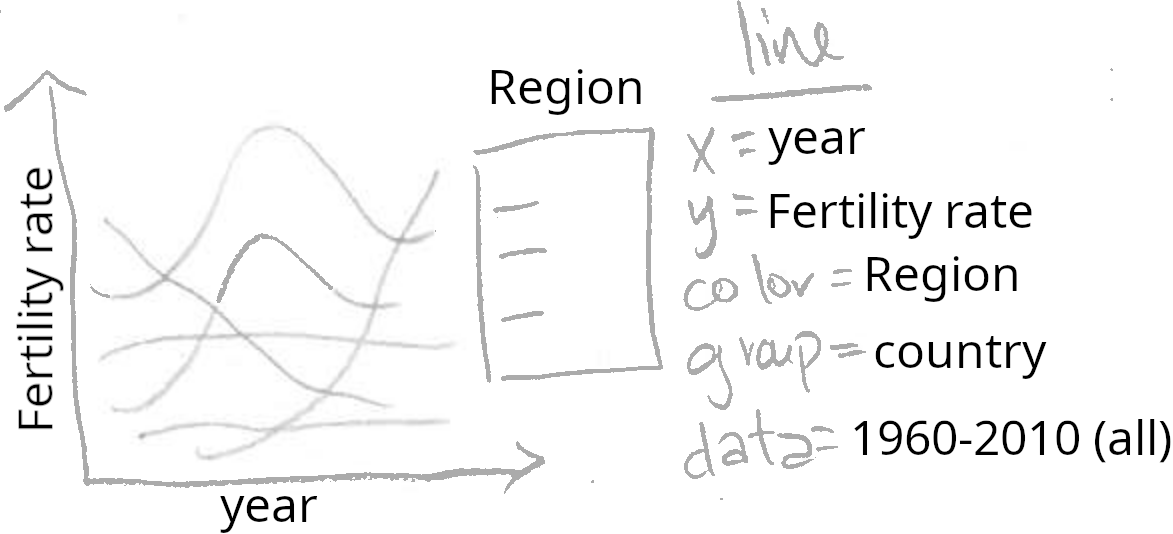
Note how the sketch above can be directly translated into the R code below. We copy the existing viz list (viz.two.layers) to a new list (viz.two.plots), then we assign a ggplot to a new element named timeSeries.
That results in a named list of two elements (both elements are ggplots with class gganimint).
summary(viz.two.plots) Length Class Mode
plot1 9 gganimint list
timeSeries 9 gganimint listThis data visualization list can be printed/rendered by typing its name. Since the list contains two ggplots, animint2 renders the data viz as two linked plots.
viz.two.plotsThe data visualization above contains two ggplots, which each map different data variables to the horizontal x axis. The time series uses aes(x=year), and shows a summary of fertility rate values over all years. The scatterplot uses aes(x=life.expectancy), and shows details of the relationship between fertility rate and life expectancy during 1975.
Try clicking a legend entry in either the scatterplot or the time series above. You should see the data and legends in both plots update simultaneously. Since aes(color=Region) was specified in both plots, animint creates a single shared selector variable called Region. Clicking either legend has the effect of updating the set of selected regions, and so animint updates the legends and data in both plots accordingly. This is the main mechanism that animint uses to create interactive data visualizations with linked plots, and will be discussed in more detail in the next two chapters.
Exercise: use animint to create a data viz with three plots, by creating a list with three ggplots. For example, you could add a time series of another data variable such as life.expectancy or population.
Note that both ggplots map the fertility rate variable to the y axis. However, since they are separate plots, the ranges of their y axes are computed separately. That means that even when the two plots are rendered side-by-side, the two y axis are not exactly aligned. That is a problem since it would make it easier to decode the data visualization if each unit of vertical space was used to show the same amount of fertility rate. To achieve that effect, we use facets in the next section.
Panels or facets are sub-plots that show related data visualizations. One of the main strengths of ggplots is that different kinds of multi-panel plots are relatively easy to create. Multi-panel data visualization is useful for two different purposes:
We begin by explaining the how facets are useful to align the axes of related plots. Consider the sketch below which contains a plot with two panels.
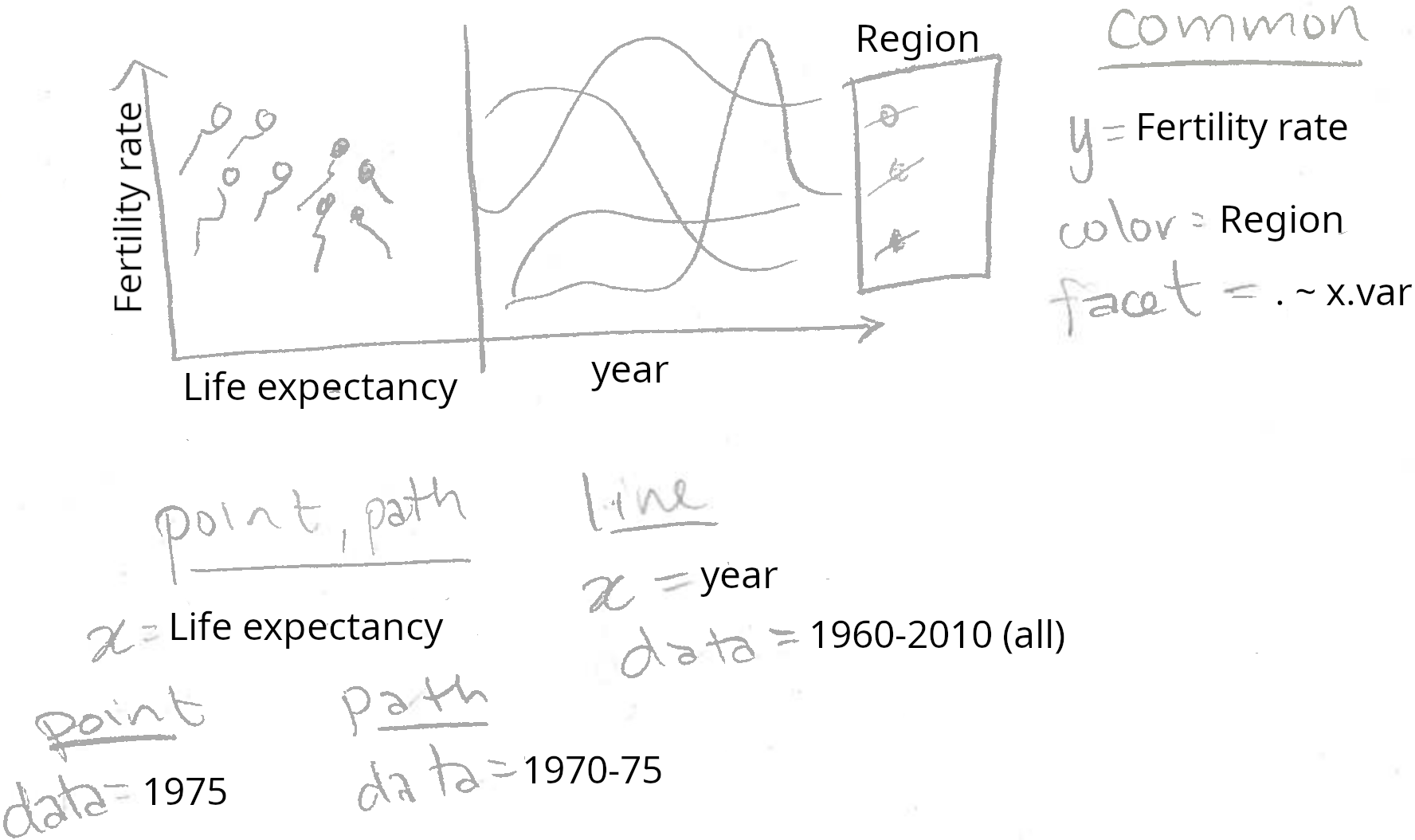
Note that the two panels plot different geoms using a panel-specific aesthetic mapping. The point and path in the left panel have x=life.expectancy, and the line in the right panel has x=year. Also note that we specified facet=x.var, so we need to add a variable called x.var to each of the three data sets. We translate this sketch to the R code below.
add.x.var <- function(df, x.var){
  data.frame(df, x.var=factor(x.var, c("life expectancy", "year")))
}
(viz.aligned <- animint(
  scatter=ggplot()+
    theme_bw()+
    theme_animint(width=600)+
    theme(panel.margin=grid::unit(0, "lines"))+
    geom_point(aes(
      x=life.expectancy, y=fertility.rate, color=Region),
      data=add.x.var(world_bank_1975, "life expectancy"))+
    geom_path(aes(
      x=life.expectancy, y=fertility.rate, color=Region,
      group=country),
      data=add.x.var(world_bank_before_1975, "life expectancy"))+
    geom_line(aes(
      x=year, y=fertility.rate, color=Region, group=country),
      data=add.x.var(world_bank, "year"))+
    xlab("")+
    facet_grid(. ~ x.var, scales="free")))
The data visualization above contains a single ggplot with two panels and three layers. The left panel shows the geom_point and geom_path, and the right panel shows the geom_line. The panels have a shared axis for fertility rate, which ensures that the lines in the time series panel can be directly compared with the points and paths in the scatterplot panel.
Note that we used the add.x.var function to add a x.var variable to each data set, and then we used that variable in facet_grid(scales="free"). We call this the addColumn then facet idiom, which is generally useful for creating a multi-panel data visualization with aligned axes. In particular, if we wanted to change the order of the panels in the data visualization, we would only need to edit the order of the factor levels in the definition of add.x.var.
Also note that theme_bw means to use black panel borders and white panel backgrounds, and panel.margin=0 means to use no space between panels. Eliminating the space between panels means that more space will be used for the panels, which serves to emphasize the data. We call this the Space saving facets idiom, which is generally useful in any ggplot with facets.
The second reason for using plots with multiple panels in a data visualization is to compare subsets of observations. This facilitates comparison between data subsets, and can be used in at least two different situations:
For example, consider the sketch below.
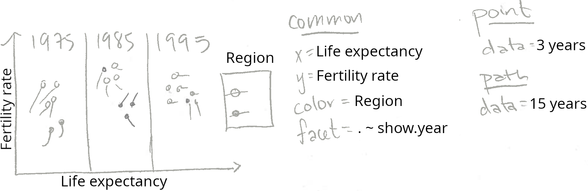
Note that the three panels plot the same two geoms (point and path). Since facet=show.year, and there are three panels shown, we will need to create data tables which have three values for the show.year variable. The geom_point has data for just 3 years, and the geom_path has data for 15 years (but 3 values of show.year). The code below creates these two data sets for three years of the world_bank data set.
show.point.list <- list()
show.path.list <- list()
for(show.year in c(1975, 1985, 1995)){
  show.point.list[[paste(show.year)]] <- data.frame(
    show.year, subset(world_bank, year==show.year))
  show.path.list[[paste(show.year)]] <- data.frame(
    show.year, subset(
      world_bank, show.year - 5 <= year & year <= show.year))
}
show.point <- do.call(rbind, show.point.list)
show.path <- do.call(rbind, show.path.list)
We used a for loop over three values of show.year, the variable which we will use later in facet_grid. For each value of show.year, we store a data subset as a named element of a list. After the for loop, we use do.call with rbind to combine the data subsets. This is an example of the list of data tables idiom, which is generally useful for interactive data visualization.
Below, we facet on the show.year variable to create a data visualization with three panels.
animint(
  scatter=ggplot()+
    geom_point(aes(
      x=life.expectancy, y=fertility.rate, color=Region),
      data=show.point)+
    geom_path(aes(
      x=life.expectancy, y=fertility.rate, color=Region,
      group=country),
      data=show.path)+
    facet_grid(. ~ show.year)+
    theme_bw()+
    theme_animint(width=600))
The data visualization above contains a single ggplot with three panels. It shows more of the world_bank data set than the previous visualizations which showed only the data from 1975. However, it still only shows a relatively small data subset. You may be tempted to try using a panel to display every year (not just 1975, 1985, and 1995). However, beware that this type of multi-panel data visualization is especially useful if there are only a few data subsets. With more than about 10 panels, it becomes difficult to see all the data at once, and thus difficult to make meaningful comparisons.
Instead of showing all of the data at once, we can instead create an animated data visualization that shows the viewer different data subsets over time. In the next chapter, we will show how the new showSelected keyword can be used to achieve animation, and reveal more details of this data set.
This chapter presented the basics of static data visualization using ggplot2. We showed how animint can be used to render a list of ggplots in a web browser. We explained two features of ggplot2 that make it ideal for data visualization: multi-layer and multi-panel graphics.
Exercises:
What are the three main advantages of ggplot2 relative to previous plotting systems such as grid and lattice?
What is the purpose of multi-layer graphics?
Create a version of viz.two.layers with aes(tooltip) computed based on the min/max values of the data shown by the geom_path. Hint: for each country in world_bank_before_1975, compute a text string to use for aes(tooltip). One way to do this is via data.table(world_bank_before_1975)[, .(tooltip=sprintf(...)), by=country].
What are the two different reasons for creating multi-panel graphics? Which of these two types is more useful with interactivity?
Let us define “A < B” to mean that “one B can contain several A.” Which of the following statements is true?
In the viz.aligned facets, why is it important to use the scales="free" argument?
In viz.aligned we showed a ggplot with a scatterplot panel on the left and a time series panel on the right. Make another version of the data visualization with the time series panel on the left and the scatterplot panel on the right.
In viz.aligned the scatterplot displays fertility rate and life expectancy, but the time series displays only fertility rate. Make another version of the data visualization that shows both time series. Hint: use both horizontal and vertical panels in facet_grid.
Use aes(size=population) in the scatterplot to show the population of each country. Hint: scale_size_animint(pixel.range=c(5, 10) means that circles with a radius of 5/10 pixels should be used represent the minimum/maximum population.
Create a multi-panel data visualization that shows each year of the world_bank data set in a separate panel. What are the limitations of using static graphics to visualize these data?
Create viz.aligned using a plotting system that is not based on the grammar of graphics. For example, you can use functions from the graphics package in R (plot, points, lines, etc), or matplotlib in Python. What are some advantages of ggplot2 and animint?
Next, Chapter 3 explains the showSelected keyword, which indicates a variable to use for subsetting the data before plotting.